MatchX — Software Walkthrough
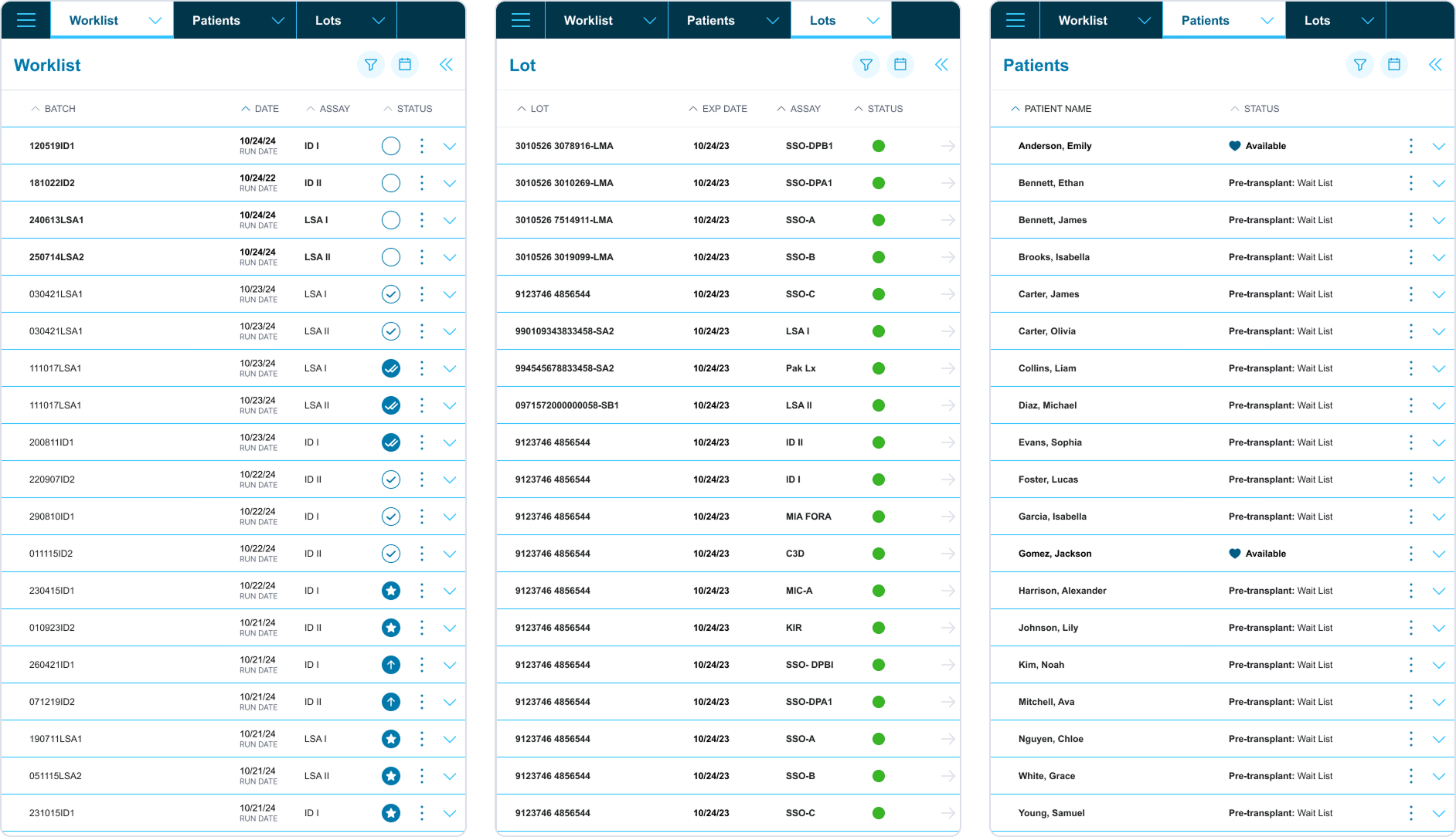
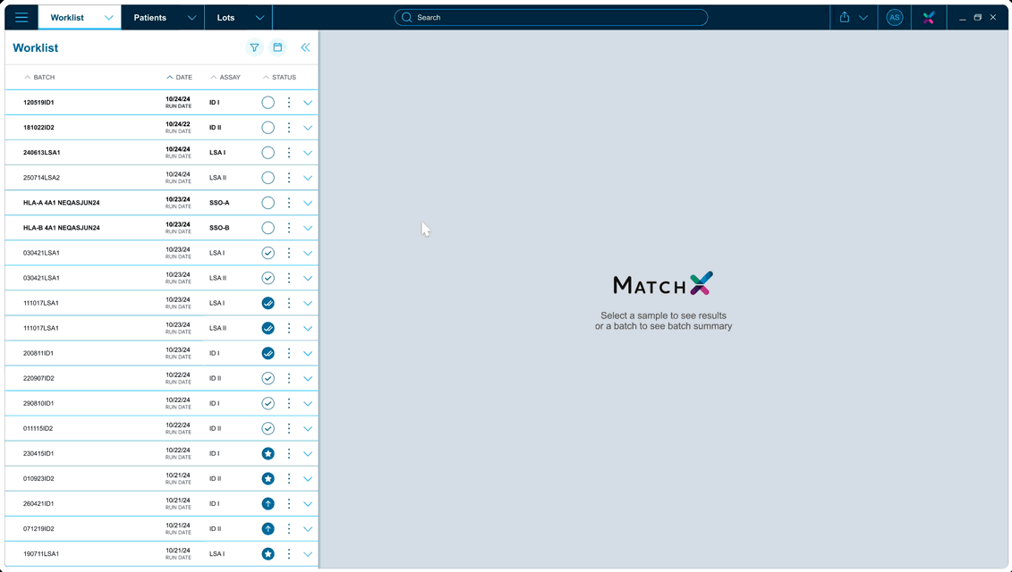
Worklist
Worklist
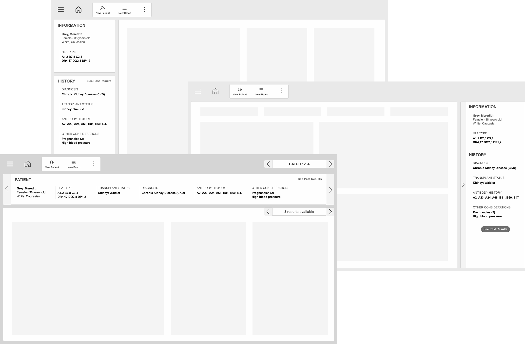
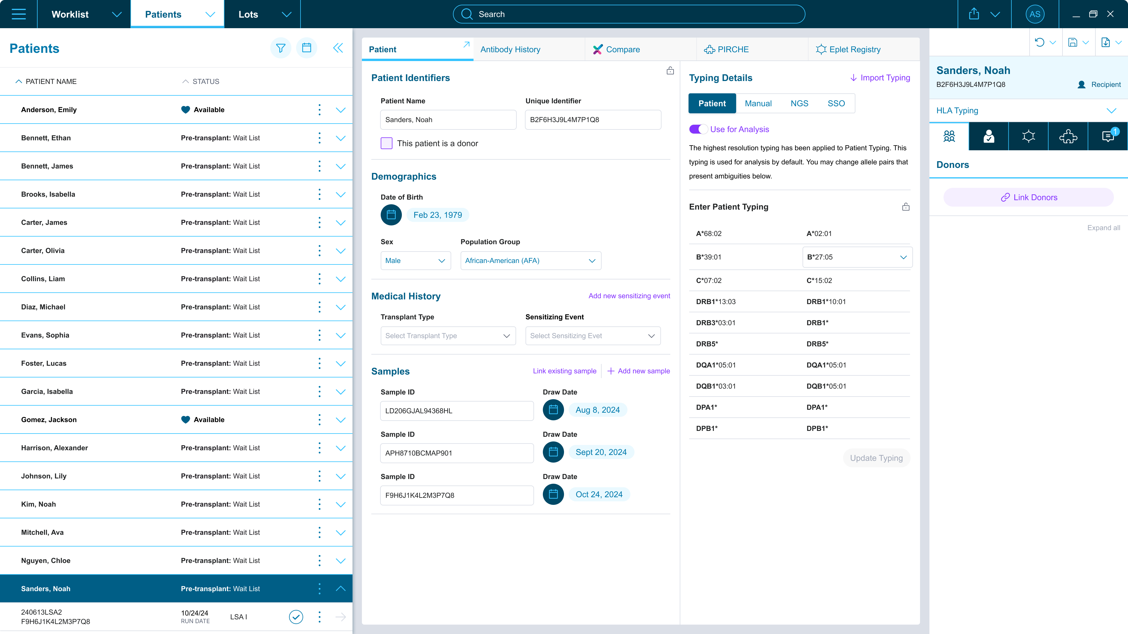
Patient List
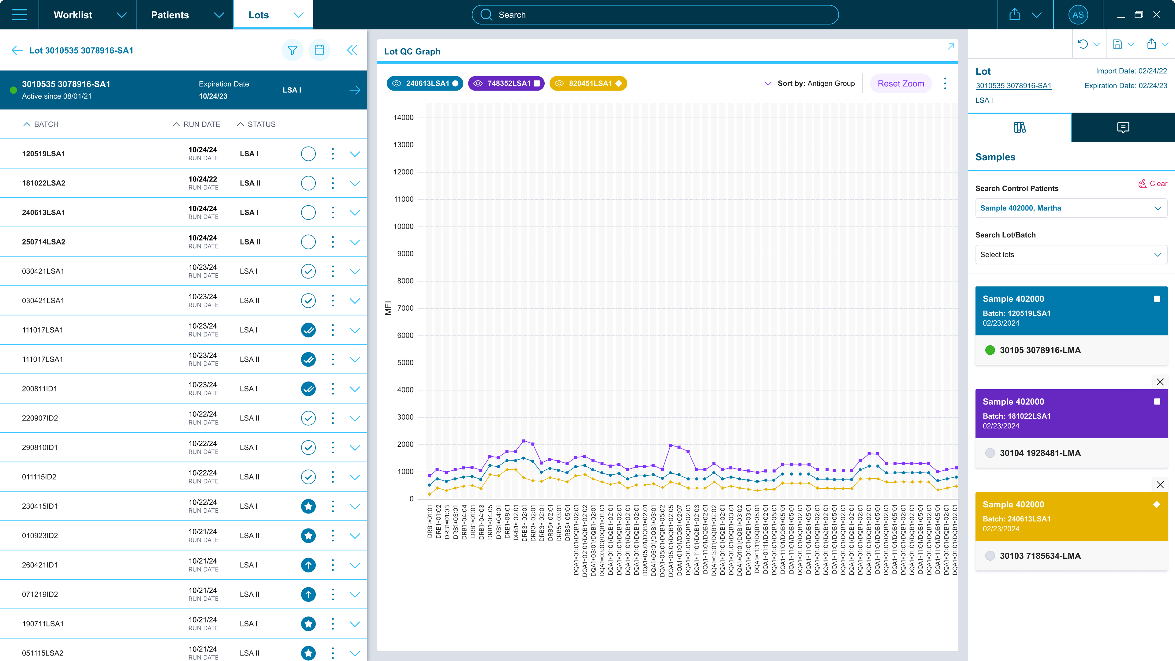
Lot List
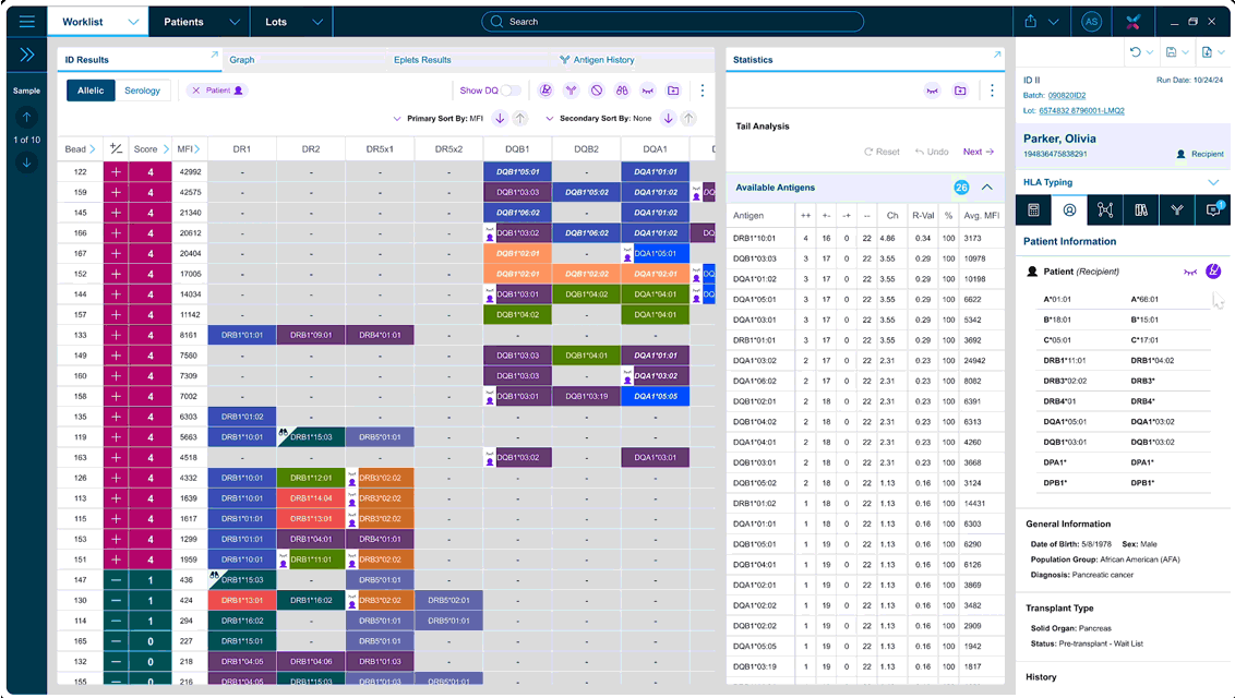
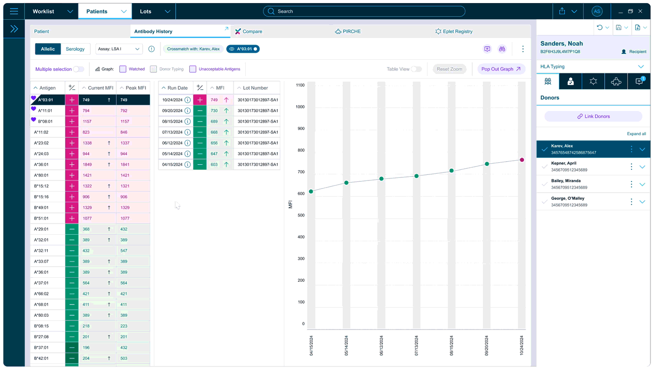
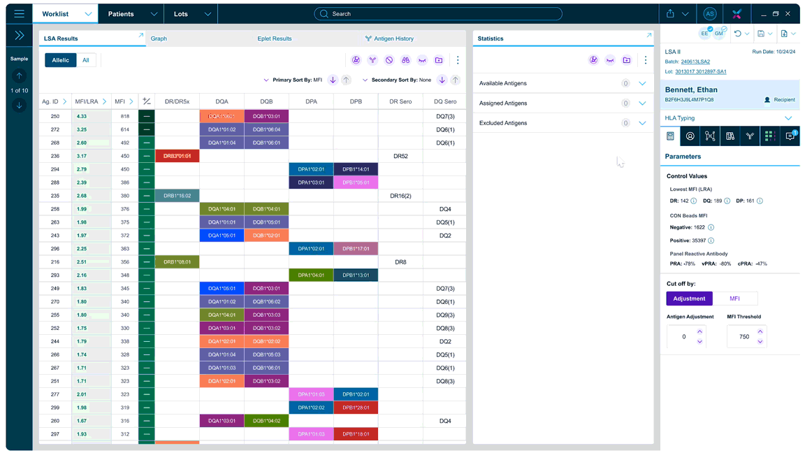
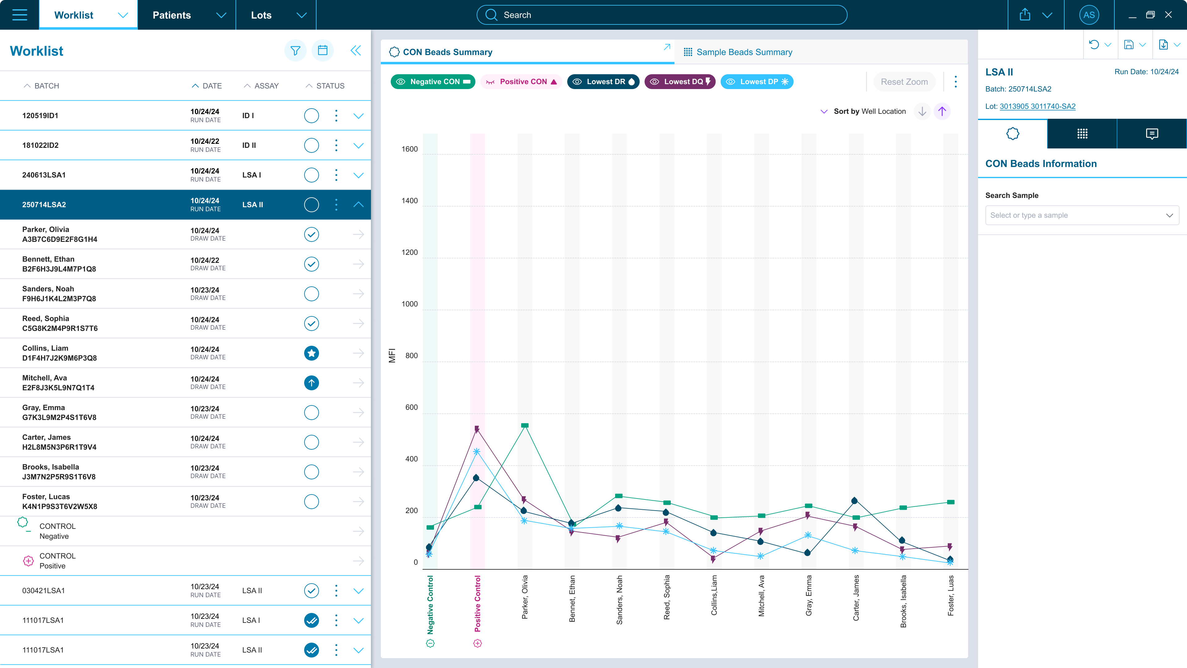
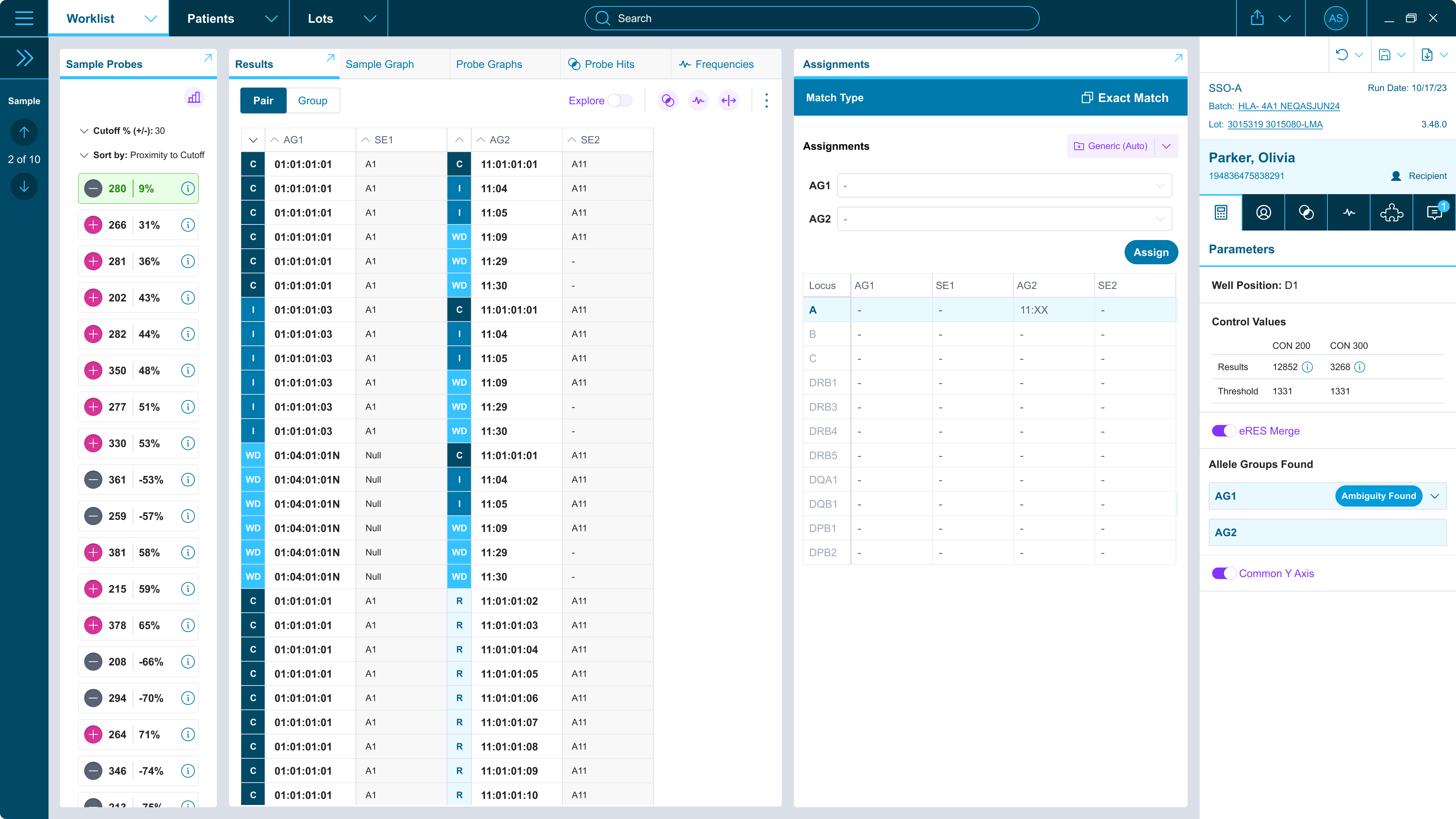
Antibody Results
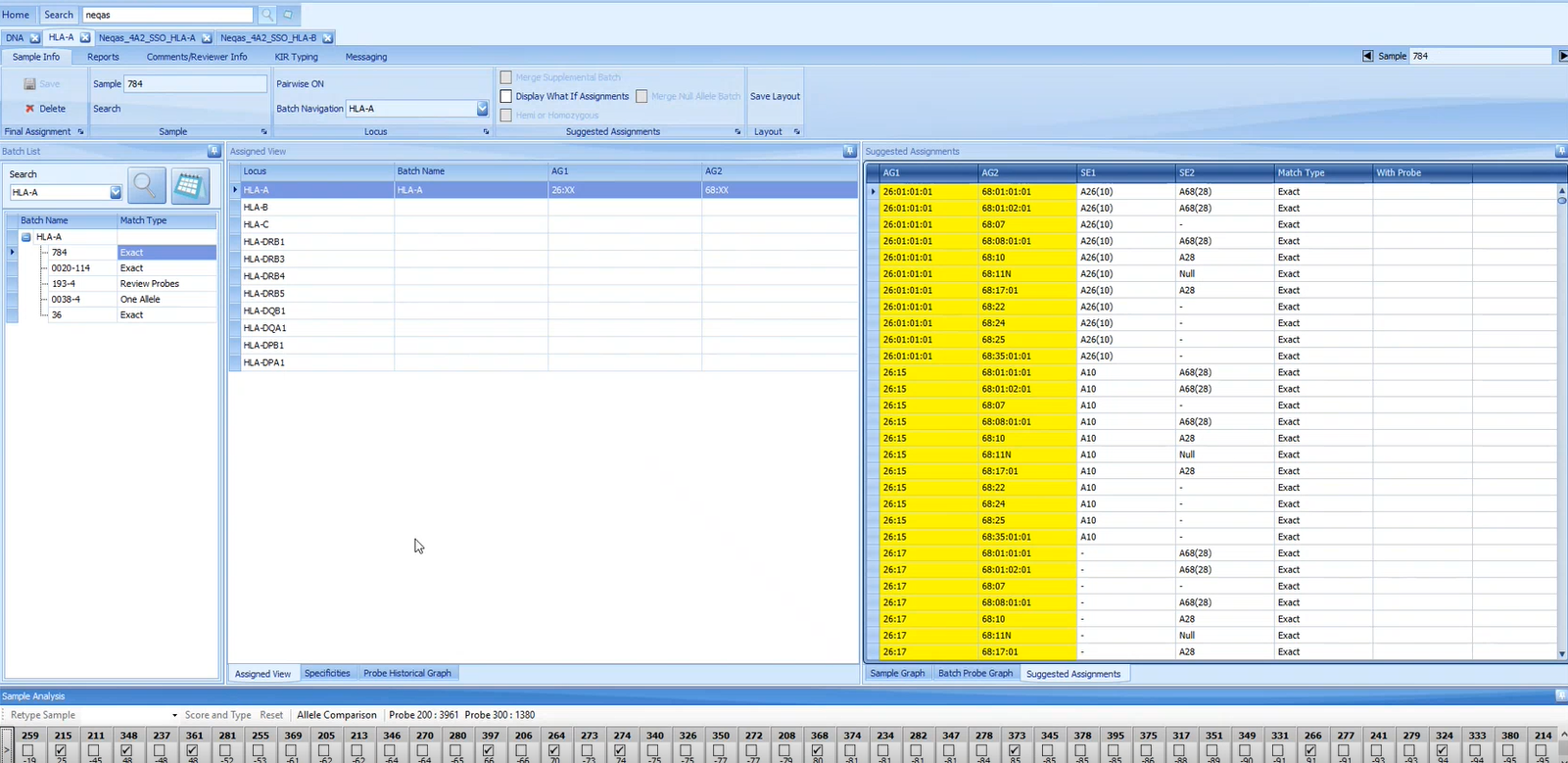
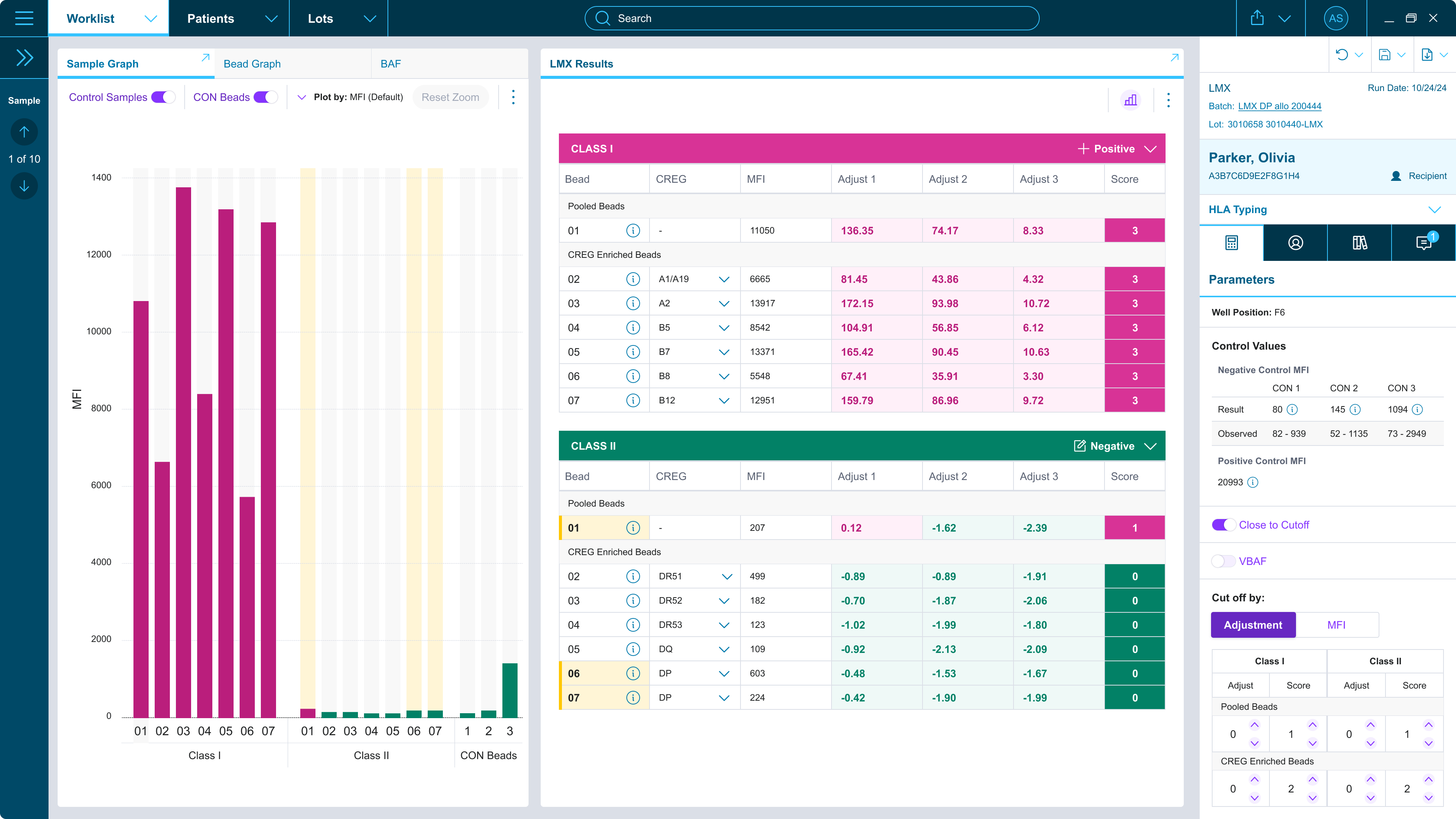
DNA Results
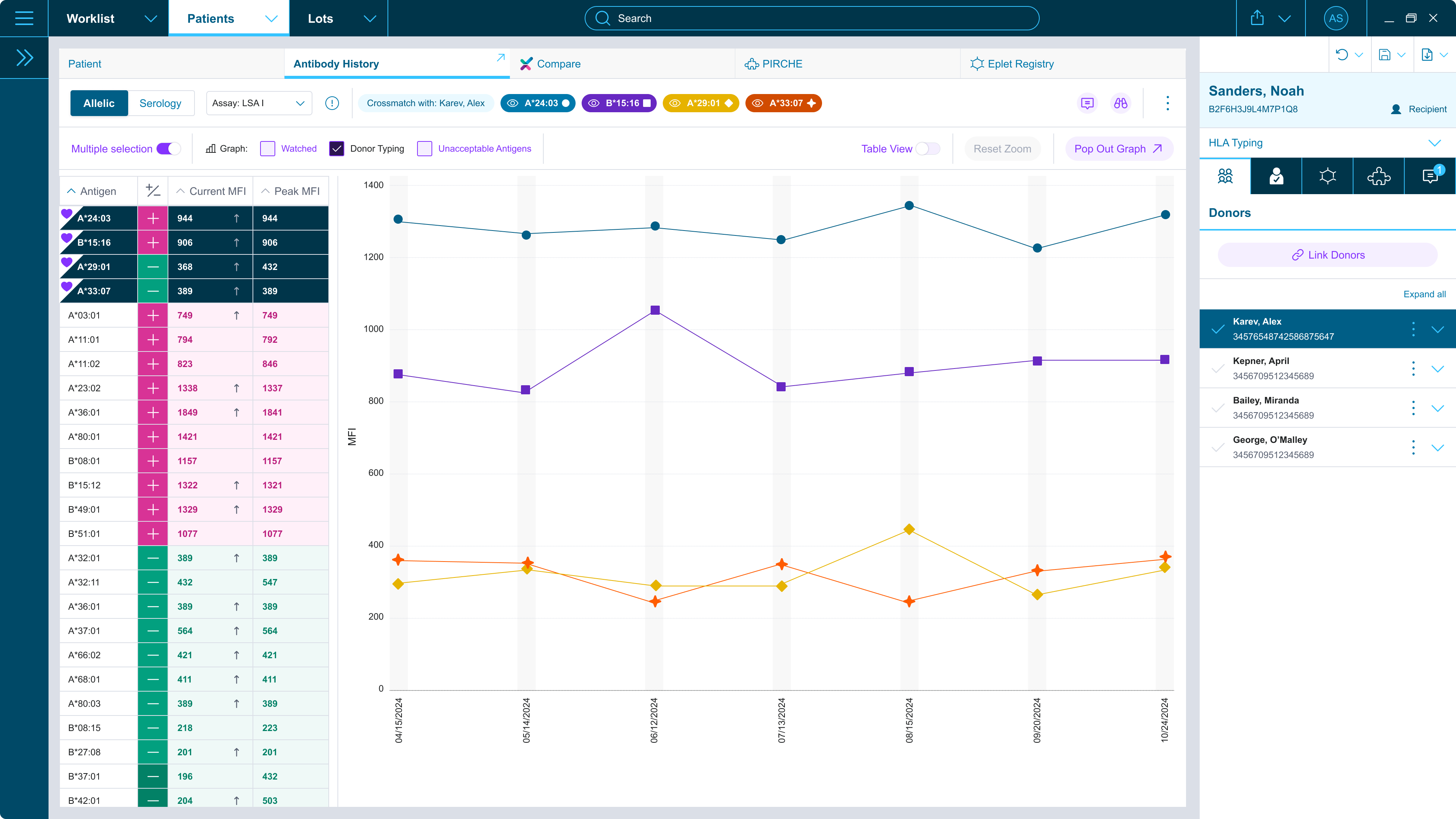
Crossmatch
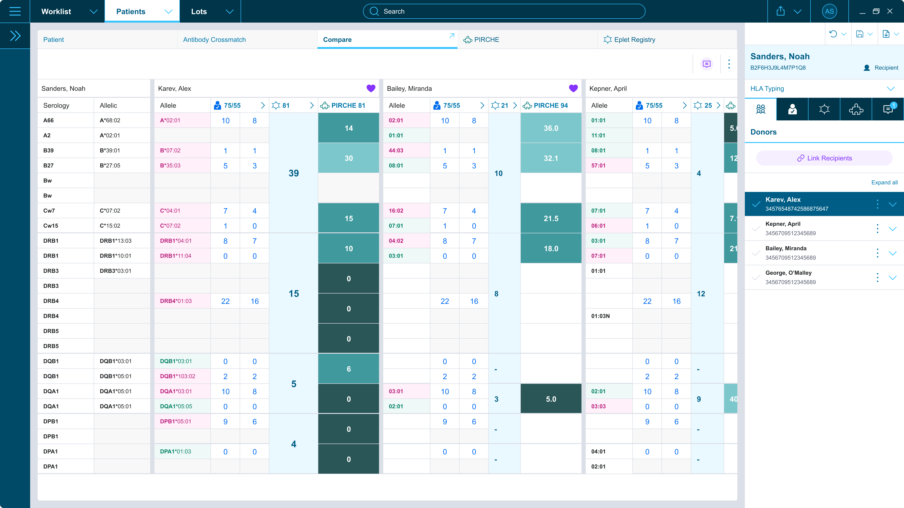
Donor Chart
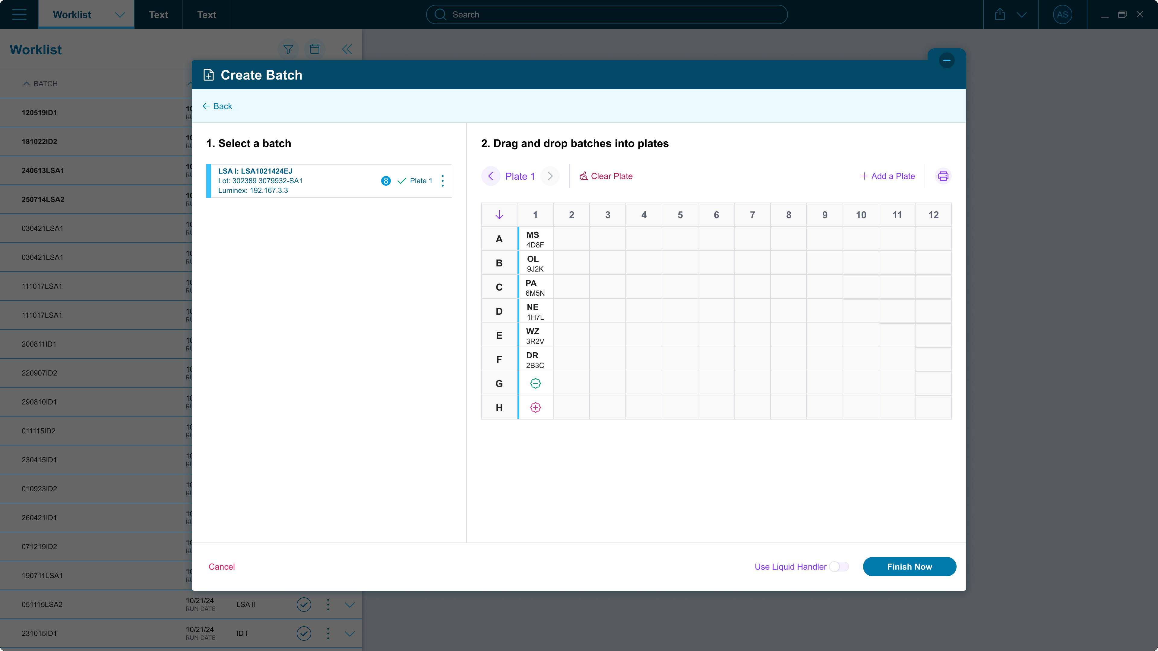
Batch Creation