Workflow Demo
See the AutoElite Console in action
Watch a full procedure flow: from setup and catheter priming through Power Pulse, dwell timing, and Thrombectomy, to see how the interface guides the technologist step by step.
Video coming soon.
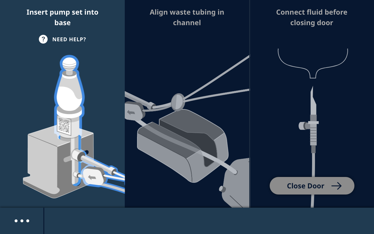
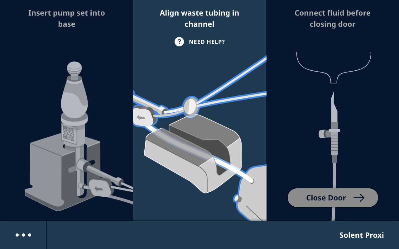
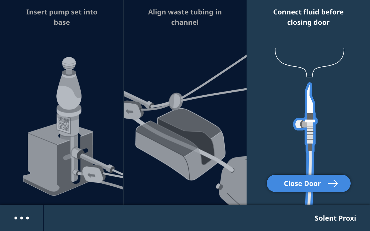
The guided setup flow: from pump insertion through catheter priming, the interface walks the technologist through each physical step.
Tutorials
History
Settings
Maintenance
Press START or insert pump set to start a new procedure
•••
Solent Proxi
Select Mode
Thrombectomy
Thrombectomy
💧
Switch fluid to SALINE
Power Pulse
Power Pulse
💧
Switch to physician-specified fluid
•••
Solent Proxi
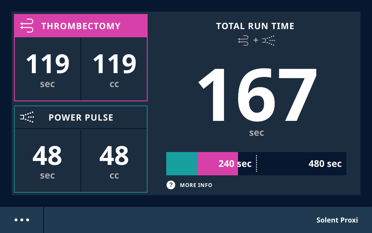
Thrombectomy
0
sec
0
cc
Power Pulse
48
sec
48
cc
Total Run Time
+
48
sec
240 sec
with blood flow480 sec
without blood flow
with blood flow480 sec
without blood flow
More Info
•••
Solent Proxi
Thrombectomy
Dwell Time
00:00
minsec
Include time elapsed since foot pedal released
•••
Solent Proxi